Company Concept Design
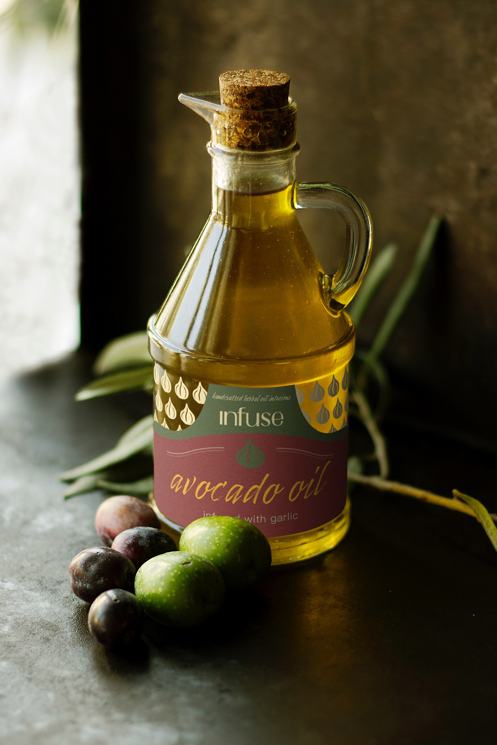
The ideas behind Infuse's logo, iconography, and label design is a direct representation of their cooking oils being an energizing, brain powering, and immunity building oil that is beneficial to every cook's kitchen. The packaging displays an exceptional, chic, vineyard design on glass bottles that echoes the ideals of the company. The demographic of this brand's target audience is primarily made up of cooks interested in furthering their skills within the restaurant or in their personal kitchen space. The modern, clean, and elegant design welcomes professional and conventional use of this product.